Cellestial Empyre Flip Phone Shopify Store Case Study
A Shopify storefront for basic and rugged flip phones, supported by product graphics, content, AI SEO and ongoing management.
Visit Live SiteThe Client
About Cellestial Empyre
Cellestial Empyre sells 4G flip phones for shoppers looking for straightforward calling and texting or a more durable device. Its public catalog separates basic and rugged phones and offers browsing by brand.
The Challenge
Flip phones are not interchangeable. Shoppers need to understand whether a device is basic or rugged, which network or carrier it supports, and which features fit their needs before moving to a product page. The store needs a clear way to browse across models and brands without hiding those differences.
Strategic Direction
Organize the public buying journey around phone type and brand, then let product-level content carry model-specific information. UBE's confirmed work spans store creation, product graphics and content, AI SEO and management; the exact historical sequence and individual theme customizations are not documented here.
What UBE Built
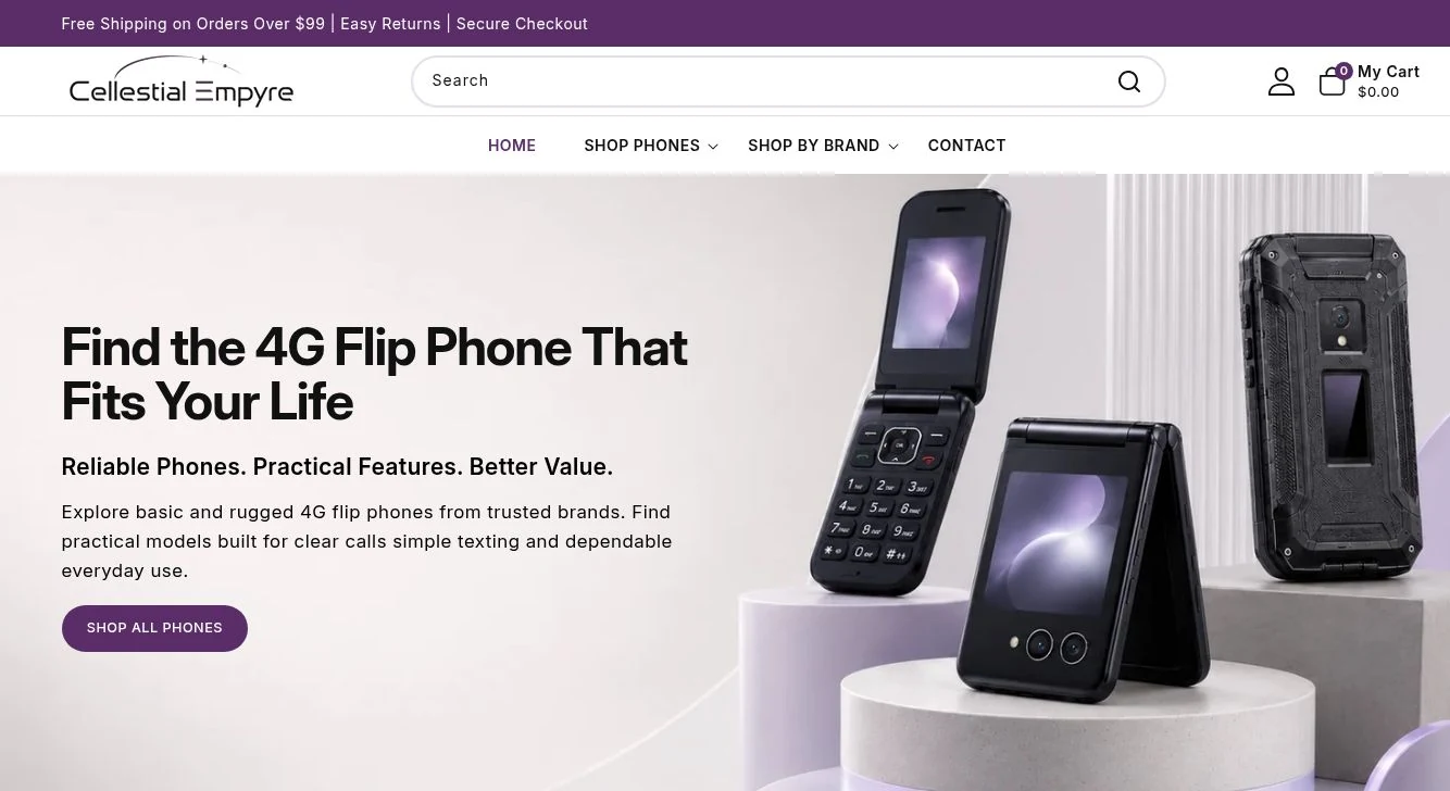
The live Shopify homepage introduces the basic-versus-rugged choice, links to the complete catalog and brand collections, and features individual models. Product listings show names, imagery, prices and purchase controls. UBE confirms creation, content, graphics, AI SEO and management at the project-scope level; specific app integrations or quantified SEO changes have not been provided.
The Client and Buying Context
Cellestial Empyre is an online store for basic and rugged 4G flip phones. The current site presents models from brands including Alcatel, BLU, Nokia, Kazuna, Kyocera, LG, Sonim and TCL. The assortment serves people who want a simpler everyday phone as well as people comparing more durable devices. That range makes the first decision on the site important: shoppers should be able to select a useful category before they are asked to compare model specifications.
The live homepage uses a clear headline, a product-focused hero, and a direct link into the catalog. It then distinguishes Basic Flip and Rugged Flip before presenting popular and featured phones. Shop-by-brand links provide a second route for visitors who already know the manufacturer they want. These are observable paths on the public storefront, not claims about traffic or customer behavior.
UBE confirms that its engagement covered store creation, product graphics, content, AI SEO and ongoing management. We can describe that service scope and the site as it appears today. We do not have a dated implementation record that assigns every theme section, product description, vendor image or application to a particular contributor, so the case study does not claim authorship of every element now visible in Shopify.
The Challenge: Make Technical Choices Easier to Navigate
A buyer may arrive knowing only that they need a flip phone. Another may search for a specific manufacturer or carrier. A third may be comparing a rugged handset for harsher use with a basic model for everyday calls. If those intentions are collapsed into a single undifferentiated product grid, the customer has to do all the sorting work. Category navigation and accurate product information are especially important for electronics because compatibility, form factor and device capabilities affect the purchase decision.
The public catalog includes product names that identify models, network or carrier details, imagery and descriptions. Those details require care: a familiar-looking device may still be locked to a particular network, and a product's exact capabilities depend on its model. The storefront therefore needs room for product-specific copy rather than relying on a generic description repeated across every phone. That is a content and merchandising problem as much as a visual-design problem.
Product graphics also need to help a shopper recognize the device before reading the specifications. The homepage image places multiple flip-phone formats together, while listing imagery shows individual phones. Together, those visual layers give a buyer an overview and a closer model-level view. UBE confirms product graphic creation as part of its project work, although the source materials do not itemize which current image was created or edited by UBE.
No approved business brief or before-and-after analytics was supplied to establish a prior conversion problem, catalog size at launch or search baseline. The challenge described here comes from the observable demands of selling several types of phones online. It does not imply that a previous store failed or that a measured customer problem was solved by a particular percentage.
Store Creation, Product Content and Graphics
UBE's owner-confirmed scope includes creating the Shopify store. On the current public site, the navigation provides entry points to all phones, basic phones, rugged phones and brand collections. A visitor can begin broadly, narrow by use case or start with a manufacturer. This makes the catalog approachable for shoppers who know different amounts about the products they need.
The homepage introduces the offer in plain language and follows the hero with category links, product selections and a featured device. Individual product pages carry model-specific information and a path into the cart. Customer-support and returns information is available from the storefront. These visible parts of the experience connect discovery to a product decision and then to a purchase action; they do not establish how many people completed that journey.
UBE also confirms product content and graphic creation. For a phone catalog, the useful content questions are concrete: what model is this, what network is it for, what practical features does it offer, and how does it differ from the next option? Product imagery can answer the first visual question, while the name, description and specifications answer the compatibility and feature questions. The project record supplied for this case study does not list a number of assets or products completed, so no production count appears here.
The visual structure of the live site makes the product the focal point. The desktop hero balances explanatory copy with device imagery. The same product-first approach continues through collection tiles and listings. On smaller screens, a buyer still needs to find the catalog, understand phone types and reach product details without depending on a wide desktop layout. This case study describes the current interface rather than claiming a particular measured mobile-speed score or conversion improvement.
AI SEO and Ongoing Store Management
UBE confirms AI SEO work for Cellestial Empyre. The public storefront supplies crawlable collection and product routes and descriptive language about basic and rugged flip phones. Clear categories and model-specific content can make a store easier for people and search systems to interpret, but a public view alone does not establish which schema changes, technical fixes, search queries or AI answer citations UBE delivered. Those would require an implementation record and measured search data.
Store management is also part of the owner-confirmed scope. An electronics catalog changes as models become available, pricing changes and descriptions need maintenance. The present site shows product cards with prices and availability states, which are operational information shoppers rely on. We do not assume a particular update frequency, number of managed SKUs or customer-support arrangement because those details were not provided.
UBE describes its connected work through The Unified System™: Brand → Build → Launch → Scale. Here, Build maps to the confirmed Shopify store creation; Launch maps to product content, graphics and AI SEO; and Scale maps to management of the continuing storefront. This is a way to explain the relationship among the services, not a claim that a documented four-stage historical engagement was executed in that precise order or that a separate identity project was commissioned.
Visible Deliverable and Evidence Limits
A visitor can now inspect a functioning Shopify storefront with a dedicated phone-focused homepage, category and brand routes, product imagery, model descriptions, prices and cart actions. The site also exposes help and contact routes. These are visible elements of the delivered online shopping experience and provide a concrete way to review the project without relying on invented financial outcomes.
UBE's stated scope includes the store, product graphics and content, AI SEO and management. The available materials do not include approved before-and-after screenshots, a dated product-asset list, private Shopify reports, organic search data, revenue, conversion rate or proof of AI citations. We therefore make no numerical performance claim. If the client later approves an implementation log or anonymized results, this page can distinguish those verified outcomes from the current descriptive record.
The live store is the best place to evaluate current catalog organization and the buyer-facing content. Pricing, stock, carrier information and products may change after this case study is prepared. Shoppers should use the live product page for current compatibility and purchasing terms; this page is a portfolio record of UBE's confirmed service scope and the publicly observable storefront.
Explore the related UBE work
This project combines store creation, product presentation, search support and management. See how those services are scoped for a new project.