Everhome Modern Real Estate Brand Architecture & Visual System
A place that truly feels like home: Minimalist real estate visual language, custom logomark, and multi channel asset matrix
The Challenge
Establishing an authentic, reassuring real estate identity that communicates institutional reliability and investment safety while delivering modern aesthetic warmth and approachable elegance.
Design Rationale
We crafted a geometric framing logomark inspired by the hand gesture of photographers searching for the perfect composition, paired with the clarity of Gotham Pro typography and a nature inspired architectural color palette.
What UBE Delivered
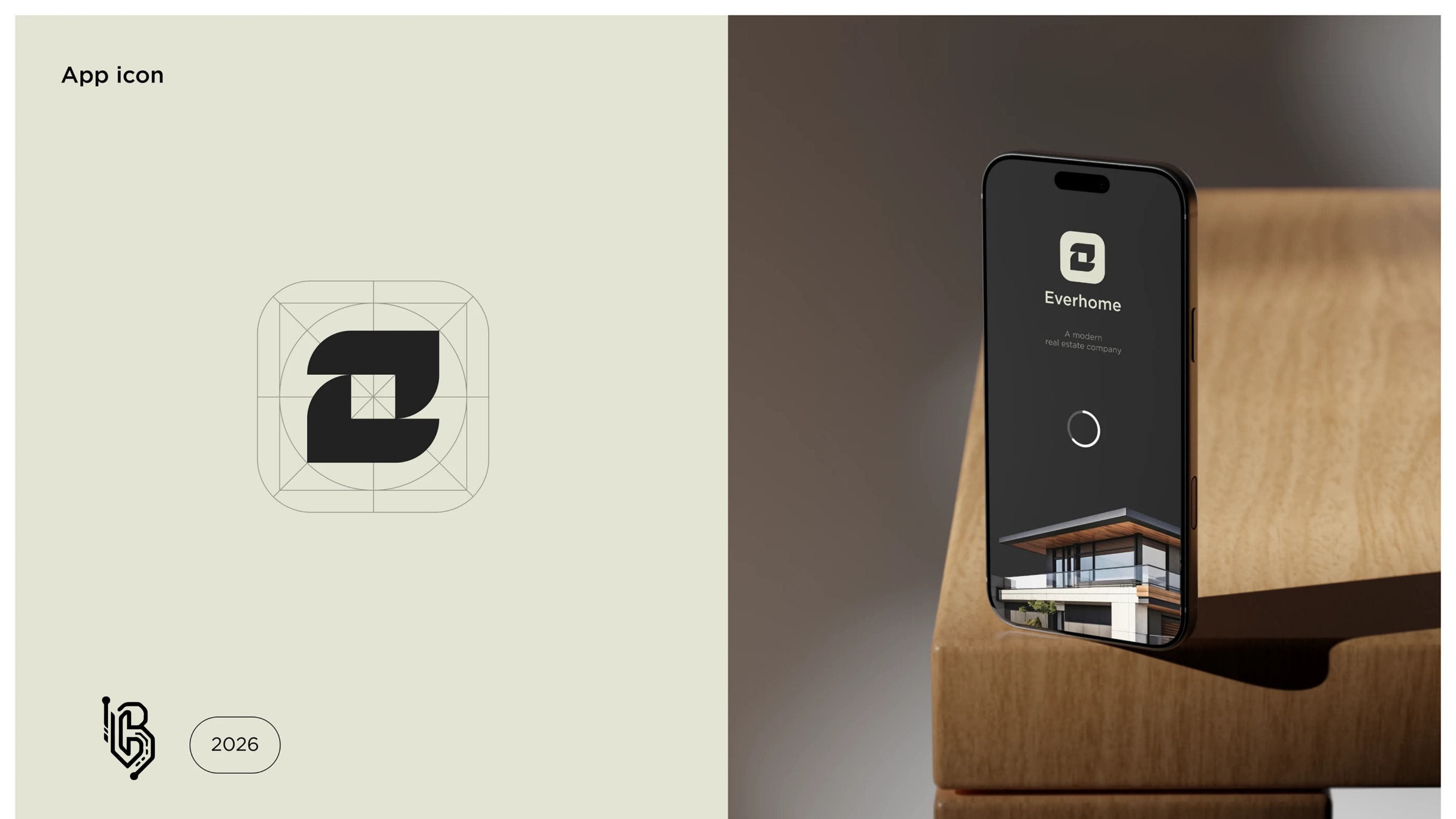
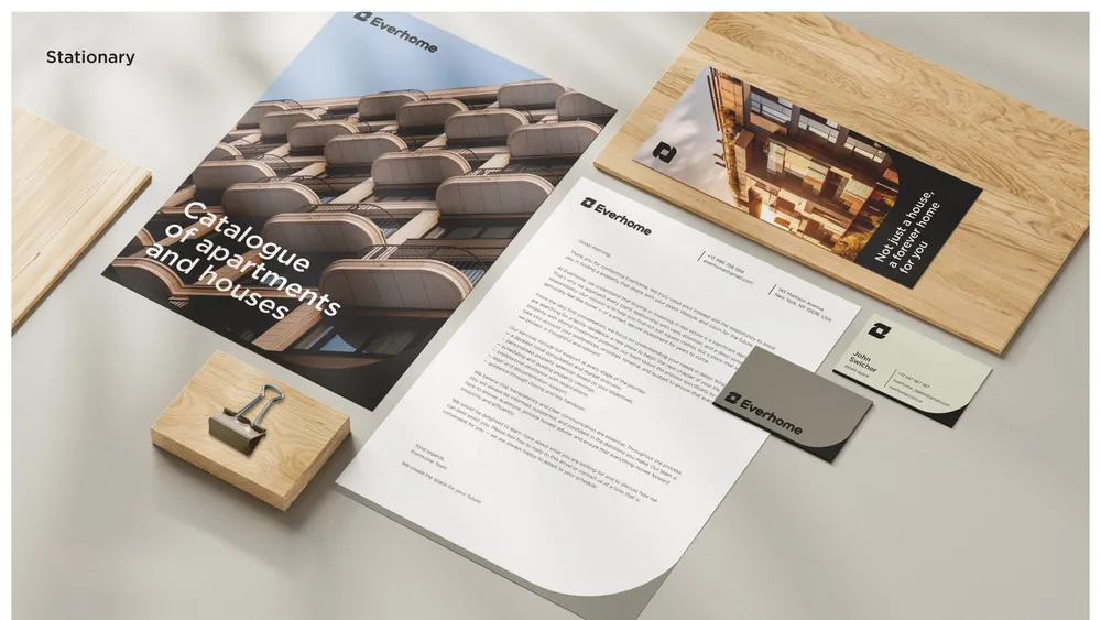
We engineered the complete brand identity system: primary logomarks and safe zone matrices, Gotham Pro typography guidelines, Moon Mist & Pastel Stone color specs, property catalogues, agent ID badges, stationery kits, and mobile application UI components.
Selected for optimal brand legibility, visual hierarchy, and cross platform consistency.
Project visuals
Project Gallery